|
|
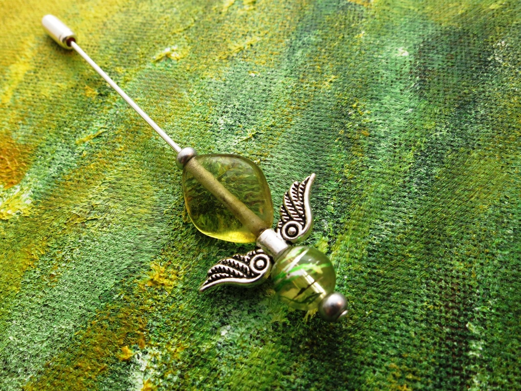
This may sound odd, but I often find product shots on a white background boring. *recoils as the internet tells me I'm wrong* I know, I know, white makes the product and colours stand out better, it's neutral, it's easier for incorporation into blog posts/magazines etc. But I often see pale background images and don't get a feel for the designer, the style, etc etc... Ok, many folks do great photos with props that help provide context, but just as often I think these can look formulaic (earrings on a teacup, or vase against B&Q white brick wallpaper anyone?) rather than enhance my understanding of their brand or prick my emotions. Mellow yellow (and green)My photo background is a painting my mum did for my first craft studio, painted to go with the yellow walls. I pulled it down one day as a background for some earrings, and boom, kept using it.  It may seem an odd choice, but:
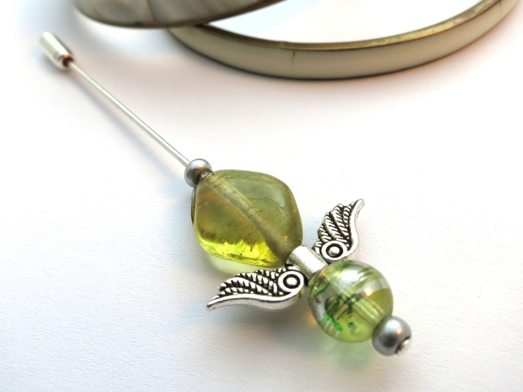
Admitting a bit of defeatRecently a lovely green pin I'd made just seemed to blend in with my green background, so I tried a shot on white. The colours of the pin do show up really well, and it pops out of the image.
Stuff it - I like what I do!However... I still like my painted background, and will be sticking with it. I uploaded the white as one of the images used for the listing on Etsy, and figured I'd see if it helps my work stand out. The answer - no more or less views or likes than any other listing added at the same time, on the green background. Etsy shoppers do seem to judge on the quality of photo and if they like the work shown, rather than if the image is a standard issue 'accepted norm' photo. All of my photos are in focus, well lit, well laid out, show the item cleanly and clearly... and that seems to be most important. A plain white background hasn't made this piece any more popular than my other work. The use of white was purely for this unusual colour of glass, and I'll only be using it when the jewellery really needs it, or if it's requested for print etc. I still feel as though the white background lacks something compared to the painted background, and for me, branding and identity win out over following the norms. And the cats agree. 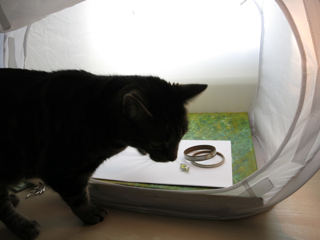
1 Comment
Gemma
9/5/2016 04:02:20 pm
I see a lot of pics on etsy and folksy etc that follow all of the 'rules' but there's nothing special about them! Leave a Reply. |

Welcome to Lisa's Perfidious Jewellery adventures. Unusual yet wearable accessories to help you share your personality with the world, plus cats, tea, and craft ideas! Categories
All
Archives
February 2024
|